UI, theming and animations in SwiftUI without NativeWind or Reanimated
How to do theming, animations and accessibility in SwiftUI coming from NativeWind and Reanimated: design tokens in the Asset Catalog, Dynamic Type as the default, SF Symbols, withAnimation, matchedGeometryEffect, PhaseAnimator, native gestures and Liquid Glass as a day-one API.
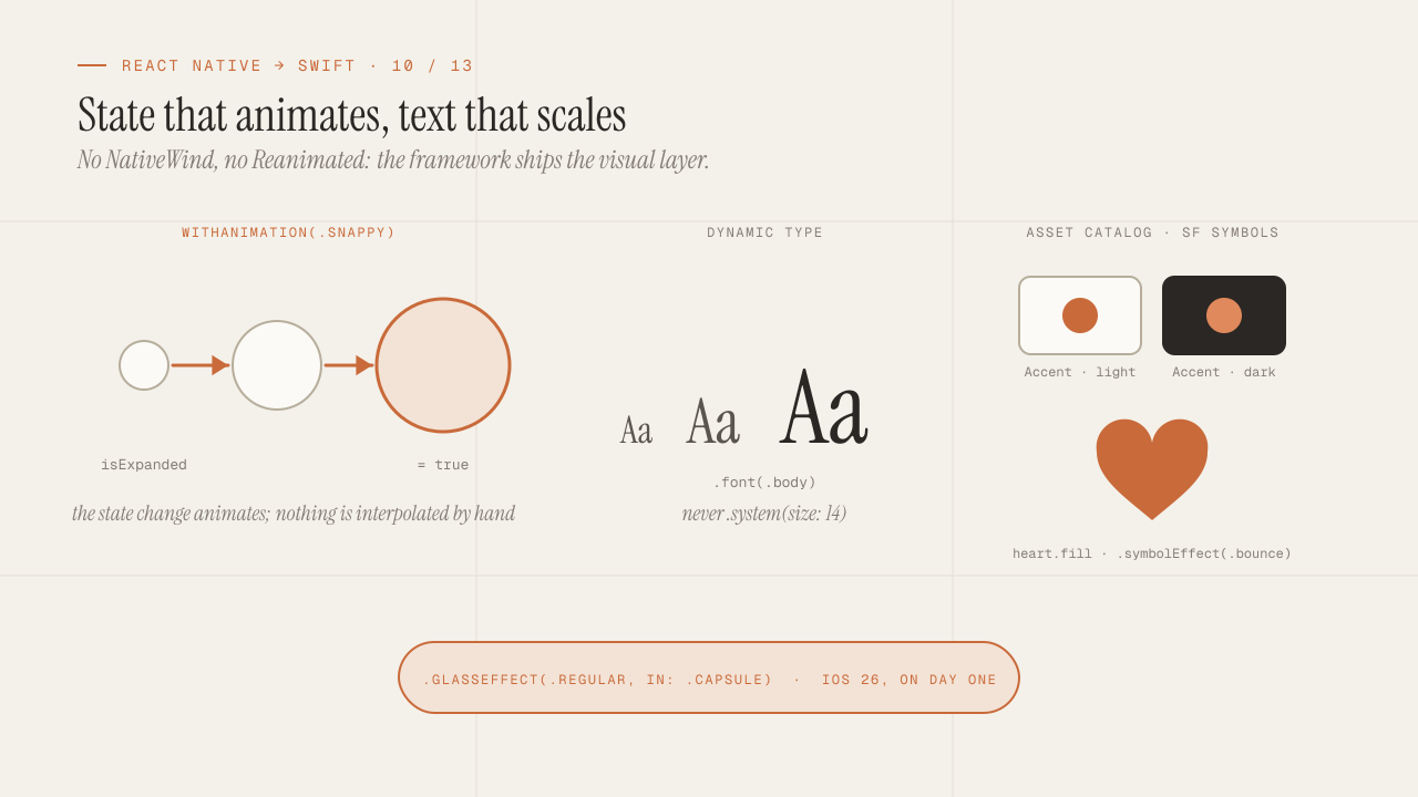
In React Native, the visual layer was assembled with two tools that did not come with the framework: NativeWind for tokens and styling utilities, and Reanimated for any animation that had to run at sixty frames per second. In SwiftUI both needs exist and neither requires a library. Tokens live in the Asset Catalog and in extensions of system types, animations are a property of the state change and run outside your code, and accessibility (Dynamic Type, VoiceOver, contrast) is not a layer you add at the end but the default behavior of every component, which you only have to avoid breaking. This post covers that whole layer, and closes with Liquid Glass as an example of what the first post in the series called a day-one API.
TL;DR
- Design tokens go in the Asset Catalog (colors with light and dark variants, plus high contrast) and in extensions of
Color,FontandShapeStyle. There are no utility classes; there are custom modifiers and component styles (ButtonStyle,LabelStyle). - An animation in SwiftUI is not a value you interpolate: it is an instruction that a state change should animate.
withAnimation,.animation(_:value:),matchedGeometryEffectandPhaseAnimatorcover what Reanimated did with shared values and worklets, with no UI thread to manage. - Dynamic Type, VoiceOver and
prefers-reduced-motionwork on their own if you use system text styles and do not fix sizes. Every.font(.system(size: 14))and every.frame(height: 44)breaks them a little.
In this article:
- Tokens — Design tokens without NativeWind · Component styles · SF Symbols
- Accessibility — Dynamic Type and VoiceOver
- Motion — Animations without Reanimated · Transitions and matchedGeometryEffect · PhaseAnimator and gestures · Liquid Glass
Design tokens without NativeWind: Asset Catalog and extensions
NativeWind gave you a tailwind.config.js with the palette and classes like bg-primary text-lg. In SwiftUI the palette goes in the Asset Catalog (Assets.xcassets), where each color is defined with its variants: light and dark appearance, optionally high contrast, per device. Xcode generates named symbols for every color and every image in the catalog, so Color.brandPrimary exists at compile time and the compiler warns you if you rename it.
On top of that, the semantic token layer is an extension:
// DesignSystem/Tokens.swift
import SwiftUI

extension Color {
    // Catalog colors: light/dark variants resolved by the system.
    static let surface = Color("Surface")
    static let surfaceRaised = Color("SurfaceRaised")
    static let accent = Color("Accent")
    static let textPrimary = Color("TextPrimary")
    static let textMuted = Color("TextMuted")
}

extension Font {
    // Always relative to a system text style: they scale with Dynamic Type.
    static let display = Font.system(.largeTitle, design: .serif, weight: .semibold)
    static let heading = Font.system(.title2, weight: .semibold)
    static let body = Font.system(.body)
    static let caption = Font.system(.caption, design: .monospaced)
}

enum Spacing {
    static let xs: CGFloat = 4
    static let sm: CGFloat = 8
    static let md: CGFloat = 16
    static let lg: CGFloat = 24
    static let xl: CGFloat = 40
}

enum Radius {
    static let card: CGFloat = 16
    static let control: CGFloat = 10
}
Two decisions you notice later:
- System semantic colors come first.
Color.primary,.secondary,Color(.systemBackground),.systemGroupedBackgroundalready change with dark mode, high contrast and context (a groupedListhas a different background). Your own tokens are added for the brand, not to reinvent what the system already resolves. - Dark mode is not implemented; it is declared. Every catalog color has its dark variant, and the system picks it. There is no
useColorScheme()with ternaries in every component. If a component needs to know the scheme (rare),@Environment(\.colorScheme)exposes it.
To force a scheme on one screen (an onboarding that is always dark), .preferredColorScheme(.dark) on that view. To preview both, #Preview(traits: .sizeThatFitsLayout) with .environment(\.colorScheme, .dark).
Component styles instead of utility classes
What in NativeWind was className="rounded-xl bg-accent px-4 py-3 text-white font-semibold" repeated on every button is, in SwiftUI, a component style: a type that describes how a button looks, applied once with a modifier, and inherited down the tree.
struct PrimaryButtonStyle: ButtonStyle {
    @Environment(\.isEnabled) private var isEnabled

    func makeBody(configuration: Configuration) -> some View {
        configuration.label
            .font(.heading)
            .padding(.horizontal, Spacing.md)
            .padding(.vertical, Spacing.sm + 4)
            .frame(maxWidth: .infinity)
            .background(isEnabled ? Color.accent : Color.textMuted, in: .rect(cornerRadius: Radius.control))
            .foregroundStyle(.white)
            .opacity(configuration.isPressed ? 0.8 : 1)
            .scaleEffect(configuration.isPressed ? 0.98 : 1)
            .animation(.easeOut(duration: 0.12), value: configuration.isPressed)
    }
}

extension ButtonStyle where Self == PrimaryButtonStyle {
    static var primary: PrimaryButtonStyle { .init() }
}

// Usage: the pressed and disabled states come already resolved.
Button("Continue") { submit() }
    .buttonStyle(.primary)
There is ButtonStyle, ToggleStyle, LabelStyle, TextFieldStyle, ProgressViewStyle, MenuStyle, and since iOS 17 styles for more containers. And for your own compositions, a ViewModifier with a View extension:
struct CardModifier: ViewModifier {
    func body(content: Content) -> some View {
        content
            .padding(Spacing.md)
            .background(Color.surfaceRaised, in: .rect(cornerRadius: Radius.card))
            .shadow(color: .black.opacity(0.06), radius: 8, y: 2)
    }
}

extension View {
    func card() -> some View { modifier(CardModifier()) }
}
The difference from utility classes is not only syntax. A style applied to a container (.buttonStyle(.primary) on a VStack) affects every button inside it, and the views do not need to know which style they carry. The design system stops being a list of classes that every screen has to remember and becomes a set of decisions applied at the top.
SF Symbols: the icons that ship with the system
@expo/vector-icons brought several icon families as fonts. iOS includes SF Symbols, more than six thousand symbols designed to align with the system typography, with nine weights, scales, variants (fill, circle, slash), rendering modes (monochrome, hierarchical, palette, multicolor) and built-in animations.
Label("Favorites", systemImage: "heart.fill")
    .symbolRenderingMode(.hierarchical)
    .foregroundStyle(.accent)

Image(systemName: "wifi")
    .symbolVariant(isConnected ? .none : .slash)
    .symbolEffect(.bounce, value: reconnectCount)     // built-in animation
Three things change compared to an icon font: symbols scale with Dynamic Type alongside the text they accompany, they align to the baseline without manual adjustments, and they have animation effects (.bounce, .pulse, .variableColor, .replace) that require nothing more than a value change. For your own icons, you import them as custom symbols into the catalog with Apple’s SF Symbols app and use them with the same API.
Dynamic Type and VoiceOver: the standard you only have to not break
In React Native, accessibility was explicit work: accessibilityLabel, allowFontScaling, testing with the screen reader. In SwiftUI, every system control already exposes its role, its label and its value to VoiceOver, and every Text with a system style scales with the font size the user picked in Settings. The job is not to add accessibility; it is to not remove it. The most common ways of removing it:
.font(.system(size: 14)). Fixed size, does not scale. Replace it with.font(.subheadline)or with a relative size:.font(.system(size: 14, relativeTo: .subheadline))..frame(height: 44)on something that contains text. With large text, the text gets clipped. Replace it withminHeight, or let the content decide.- An
HStackwith text and controls that do not fit at large sizes. UseViewThatFitsto offer a vertical variant, or@Environment(\.dynamicTypeSize)to switch the layout starting at.accessibility1. - A decorative
Imageleft unmarked. VoiceOver reads it as “image”.Image(decorative: "pattern")skips it. - A button built with an
onTapGestureon a view. It has no button role. UseButtonwith a style, which also handles the pressed state.
And the two that add value with one line:
// A group of views that VoiceOver should read as a single card.
OrderCard(order: order)
    .accessibilityElement(children: .combine)

// An action available without hunting for the button inside the card.
    .accessibilityAction(named: "Reorder") { reorder(order) }
On motion: @Environment(\.accessibilityReduceMotion) tells you whether the user asked to reduce animations. System transitions already respect it; yours should too: a withAnimation(reduceMotion ? nil : .spring) or an .opacity transition instead of .move. It is the equivalent of prefers-reduced-motion on the web, and on iOS a percentage of users turn it on.
The fast way to test all of this is Xcode’s Accessibility Inspector and, in Previews, the .dynamicTypeSize(.accessibility3) modifier to see the screen with huge text without changing the device Settings. A screen that survives .accessibility3 survives almost anything.
Animations without Reanimated: the state change is what animates
Reanimated solved a real React Native problem: animations driven by React state run on the JavaScript thread and stutter when that thread is busy. That is why shared values, worklets and the UI thread existed. In SwiftUI that problem does not exist: animations are executed by the render engine outside your code, and your code only declares which state change should animate and with which curve.
struct Expandable: View {
    @State private var isExpanded = false

    var body: some View {
        VStack {
            Text("Details")
            if isExpanded {
                Text("Long content that appears and disappears.")
            }
        }
        .onTapGesture {
            withAnimation(.snappy) {      // everything that changes because of this set animates
                isExpanded.toggle()
            }
        }
    }
}
withAnimation wraps the state change, and SwiftUI interpolates everything that change affects: sizes, positions, opacities, colors, even the views that appear or disappear (with a default fade transition). There is no useSharedValue or useAnimatedStyle; the animatable value is the state itself.
The second form, .animation(_:value:), ties the animation to a view and to a specific value, so it animates only when that value changes, regardless of who changed it:
Circle()
    .fill(isOnline ? .green : .gray)
    .scaleEffect(isOnline ? 1 : 0.8)
    .animation(.bouncy, value: isOnline)
The curves: .linear, .easeIn, .easeOut, .easeInOut with a duration; .spring with physical parameters; and the presets .snappy, .bouncy, .smooth that cover most cases. Spring animations are interruptible by default: if the state changes mid-animation, the new animation starts from the current velocity, without the jump that in Reanimated required handling withSpring carefully.
For values that are not system types (a custom percentage, a custom shape), the Animatable protocol with animatableData tells SwiftUI how to interpolate your type. A Shape with an animatable progress is the way to draw a chart that animates when it appears.
Transitions and matchedGeometryEffect
A transition defines how a view enters and leaves when it appears or disappears inside an animation:
if showBanner {
    Banner()
        .transition(.move(edge: .top).combined(with: .opacity))
}.opacity, .scale, .move(edge:), .slide, .push(from:), .blurReplace, and .asymmetric(insertion:removal:) so it enters one way and leaves another. They combine with .combined(with:).
matchedGeometryEffect is what replaces the “shared element transition” pattern that in React Native required a library and a bridge to the navigation. Two views with the same id and the same Namespace are interpreted as the same view in two places, and when the state that shows one or the other changes, SwiftUI animates the frame between the two positions:
struct Gallery: View {
    @Namespace private var hero
    @State private var selected: Photo?

    var body: some View {
        ZStack {
            ScrollView {
                LazyVGrid(columns: [.init(.adaptive(minimum: 100))]) {
                    ForEach(photos) { photo in
                        Thumbnail(photo)
                            .matchedGeometryEffect(id: photo.id, in: hero)
                            .onTapGesture { withAnimation(.snappy) { selected = photo } }
                    }
                }
            }
            if let selected {
                FullPhoto(selected)
                    .matchedGeometryEffect(id: selected.id, in: hero)
                    .onTapGesture { withAnimation(.snappy) { self.selected = nil } }
            }
        }
    }
}
The thumbnail grows to fill the screen and comes back. The same thing between screens of a NavigationStack is done with .navigationTransition(.zoom(sourceID:in:)) since iOS 18. It is the kind of effect a client asks for in the demo and that in native costs ten lines.
PhaseAnimator, keyframes and native gestures
For animations with several stages, what in Reanimated was a withSequence chain or a withRepeat, SwiftUI has two tools since iOS 17.
PhaseAnimator walks through a list of phases and animates between them, in a loop or triggered by a value:
enum Pulse: CaseIterable { case idle, grow, fade }

Image(systemName: "bell.fill")
    .phaseAnimator(Pulse.allCases, trigger: notificationCount) { view, phase in
        view
            .scaleEffect(phase == .grow ? 1.3 : 1)
            .opacity(phase == .fade ? 0.5 : 1)
    } animation: { phase in
        switch phase {
        case .idle: .smooth
        case .grow: .snappy(duration: 0.2)
        case .fade: .easeOut(duration: 0.4)
        }
    }
KeyframeAnimator controls several properties on a timeline with independent curves, like a “shake” animation or a logo that enters in parts. It takes a struct with the animatable values and a list of tracks (KeyframeTrack) with their keyframes.
On gestures: react-native-gesture-handler was necessary because gestures had to be recognized outside the JavaScript thread. In SwiftUI, DragGesture, MagnifyGesture, RotateGesture, LongPressGesture and TapGesture are native, composable (.simultaneously(with:), .sequenced(before:), .exclusively(before:)) and their state is bound to the view’s with @GestureState, which resets on its own when the gesture ends:
struct DraggableCard: View {
    @GestureState private var offset: CGSize = .zero

    var body: some View {
        Card()
            .offset(offset)
            .gesture(
                DragGesture()
                    .updating($offset) { value, state, _ in
                        state = value.translation           // while dragging
                    }
                    .onEnded { value in
                        if abs(value.translation.width) > 120 { dismiss() }
                    }
            )
            .animation(.spring, value: offset)              // returns to center on release
    }
}
The @GestureState goes back to .zero when the gesture ends, and the animation tied to offset returns the card to the center. That is twelve lines for a “swipe to dismiss” with spring physics that can be interrupted. What is missing is the UI thread to manage, because the gesture and the animation already live there.
Liquid Glass: a day-one API
The first post mentioned Liquid Glass as an example of a “day-one API”. It is worth closing with it because it shows the difference concretely.
Liquid Glass is the visual language Apple introduced in iOS 26: translucent surfaces with refraction and reflection of the content behind them, applied to system bars, controls and containers. SwiftUI apps that use standard components (TabView, NavigationStack, toolbar, sheet) adopted it by recompiling with the iOS 26 SDK, without changing code. To apply it to your own views, there is a modifier:
FloatingActions()
    .glassEffect(.regular, in: .capsule)

// Several glass elements that merge as they get close:
GlassEffectContainer {
    HStack {
        Button { } label: { Image(systemName: "plus") }
        Button { } label: { Image(systemName: "square.and.arrow.up") }
    }
    .buttonStyle(.glass)
}
What matters is not the effect but the calendar. It was announced in June 2025; by September 2025 it was in production for any app compiled with Xcode 26. In React Native, for the same result, a native module had to expose the effect, a config plugin had to integrate it, and the community navigation components had to adopt it, a process measured in months. That gap is what a client who wants to “look like Apple’s apps” on launch day is paying for when they choose native.
It is not that every app should adopt every visual change from Apple on the first day. It is that the option to do so, and to decide not to, is yours and not a module’s community’s.
Frequently asked questions
Is there something like Tailwind or NativeWind for SwiftUI?
There are experiments, and none has adoption. SwiftUI’s model (component styles, custom modifiers, an environment that inherits) covers the same ground with less indirection, and utility classes do not fit well with a system that has no DOM to style. After a couple of projects, I have not missed it.
How do I share design tokens with the web or with Android?
With a source file (Style Dictionary or Tokens Studio JSON) and a script that generates the Asset Catalog and the Color extension for iOS, along with the CSS or the Compose file for the others. The Asset Catalog is a directory of JSON, so generating it is straightforward. Do not do it by hand twice.
Do SwiftUI animations perform as well as Reanimated’s?
The same or better, because they run in the system compositor without going through your code on every frame. What can degrade them are animations on views that are expensive to re-evaluate (a heavy body that gets recomputed during the animation) or effects like large blurs. Instruments with the SwiftUI template shows which body is being evaluated during an animation.
How do I make a scroll-driven animation, like a header that shrinks?
With .scrollTransition for per-element effects based on their position in the scroll, and with onScrollGeometryChange (iOS 18) to read the offset and derive state. Before iOS 18, a GeometryReader inside the scroll with a PreferenceKey, which is more code and is what you will see in older examples.
Does Lottie work in SwiftUI?
Yes, with Airbnb’s official package via SPM, which includes a SwiftUI view. For complex vector animations made by a design team it is still the practical option; for everything else, the native tools in this post are usually enough.
Conclusion
SwiftUI’s visual layer does not need NativeWind or Reanimated because the framework already includes what those libraries added to React Native: tokens in the Asset Catalog with appearance variants, component styles that inherit down the tree, SF Symbols that scale and animate with the text, accessibility as default behavior you only have to not break, and animations declared on the state change that run outside your code. withAnimation, matchedGeometryEffect, PhaseAnimator and native gestures cover what used to require shared values and a UI thread. And Liquid Glass is the proof that in native the decision to adopt what is new is yours, the day it ships.
To get started: define the colors in the catalog with a dark variant, write a ButtonStyle and a card modifier before the first screen, test every view with .dynamicTypeSize(.accessibility3) in the Preview, and always animate with withAnimation on state, never with timers. The next post leaves the code and goes into what EAS hid: certificates, profiles, entitlements, TestFlight, App Review and the Privacy Manifest.
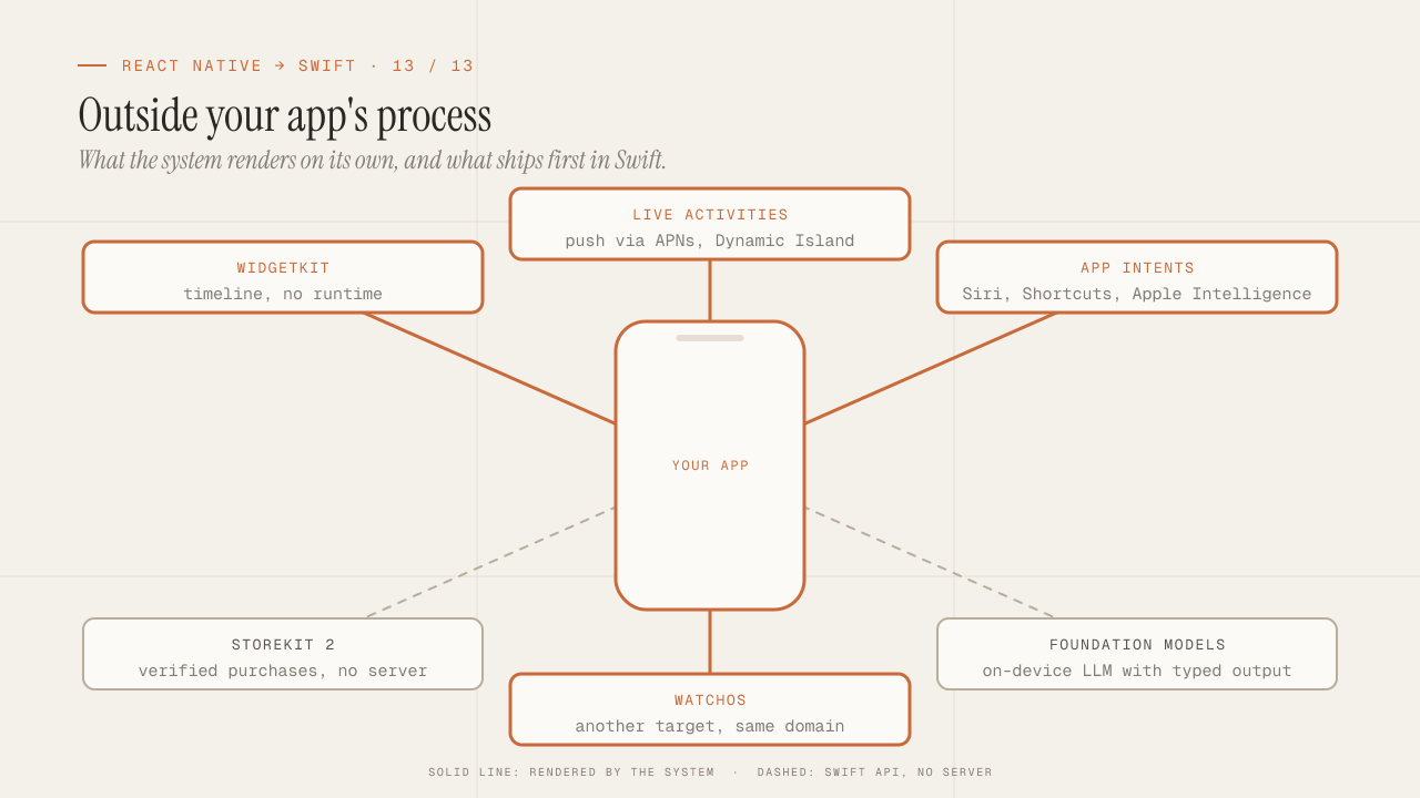
What you can only do in native: WidgetKit, Live Activities, App Intents, StoreKit 2, Foundation Models and watchOS
The iOS capabilities React Native does not offer and that justify Swift to a client: WidgetKit, Live Activities, App Intents and Siri, StoreKit 2, the on-device language model with Foundation Models and watchOS. Series close and sales argument.
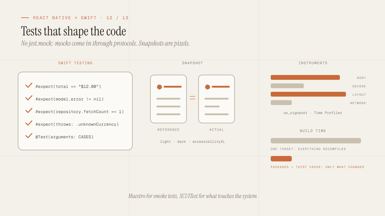
iOS testing and tooling for seniors: Swift Testing, snapshots, mocks, Instruments and build times
How to test an iOS app coming from Jest and Testing Library: Swift Testing versus XCTest, snapshot testing, mocks via protocols and URLProtocol without jest.mock, XCUITest versus Maestro, Instruments, SwiftLint and modularizing to cut build times.
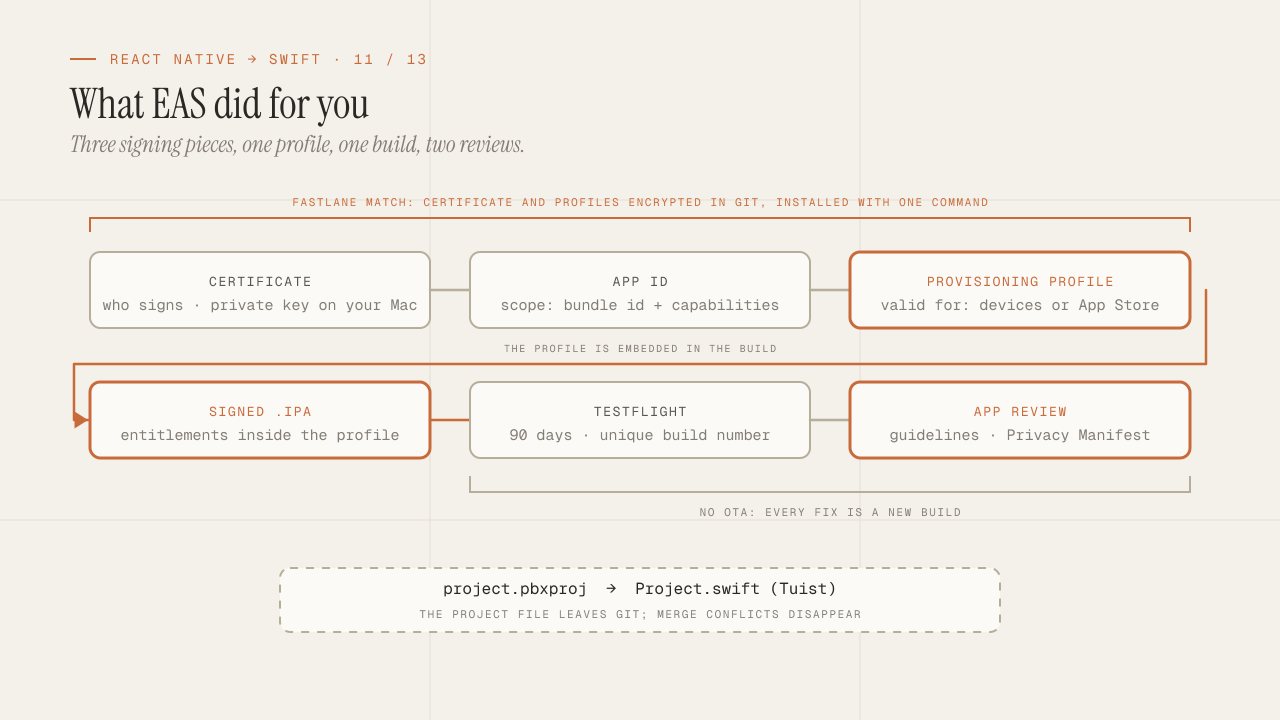
Build, signing and the App Store: what EAS hid from you
What EAS Build did for you and is now yours: certificates, provisioning profiles and entitlements explained once, Fastlane match for team signing, TestFlight, the App Review guidelines that reject the most, the Privacy Manifest and Tuist.
